I tried to create a table in AngularJS with sticky header and footer. I've managed to do that; here's a Plunker demo and code:
<body ng-controller="MainCtrl as ctrl"> <table class="table table-bordered table-hover"> <thead> <tr> <th> Column1 </th> <th> Column2 </th> <th> Column3 </th> <th> Column4 </th> <th> Column5 </th> </tr> </thead> <tbody> <tr class="info" ng-repeat="item in items"> <td> {{item.name}} </td> <td> {{item.type}} </td> <td> {{item.value}} </td> <td> {{item.code}} </td> <td> {{item.id}} </td> </tr> </tbody> <tfoot> <tr> <th> Column1 </th> <th> Column2 </th> <th> Column3 </th> <th> Column4 </th> <th> Column5 </th> </tr> </tfoot> </table> </body> But the only problems are:
- The column width isn't dynamic, as you can see, in the first row the data overflows into the 2nd column.
- The columns are misaligned.
Any idea how to fix this?
12 Answers
Answers 1
The criteria for success of this question are:
- Pure CSS.
- Dynamically sized columns.
- Sticky header and footer that size with the columns.
What you want is impossible.
The reason why the cells are almost right is because the table is semi-there, but there are actually multiple tables in the document. By overriding the <table> elements display type to flex, you've rendered the page in several different groups. The <thead> and <tfoot> are their own table, and their <tbody> is its own table. They do not size to one another, rather to other table cells in their own group.
Other CSS guides about this topic require a fixed width. http://joshondesign.com/2015/05/23/csstable
After playing around with it (specifically, trying to move the thead and tfoot to fixed positions), I've decided that any attempt to give specific rules to the header/footer breaks the table layout and will cause the sizing to work differently, which is why fixed width is required on the cells. Even in the examples, they are broken in this way, but the fixed width nullifies the problem.
Your absolute easiest fix is to fix the widths and give them overflow-x properties.
The alternative is to use JavaScript. With JS, all bets are off, and you can do anything you imagine. Specifically, you could use JS to autosize cells. I remember having success with a jQuery plugin that accomplished that.
https://www.datatables.net/
Otherwise, no. I cannot find any example online that does what you need it to do. Any attempts to get this specific layout working is a hack and you're better off making a no-JS version with overflow-x cells and fixed widths, and a JS-enabled version that autosizes cells.
Answers 2
As you already know from the other answers, you should remove white-space: nowrap;, but there's also something you can do about the scrollbar:
table thead, table tfoot { width: calc(100% - 17px); } 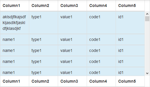
this looks perfect on my PC because the Windows scrollbars are 17px broad. If you want to be safe and check the scrollbar width, use this:
window.onload = function() { var tr = document.getElementById("__tbody").children[0]; var scrWidth = window.innerWidth - tr.clientWidth - 3; var width = "calc(100% - " + scrWidth + "px)"; document.getElementById("__thead").style.width = width; document.getElementById("__tfoot").style.width = width; } This calculates how broad the scrollbars are and then adjusts thead and tfoot. Of course then you have to set the ids <thead id="__thead">, <tbody id="__tbody"> and <tfoot id="__tfoot">.
Answers 3
In order to return the table back to its normal, dynamically-resizing self, there are a few steps to follow. Each step mentioned will give freedom back to its respective table elements, making their lives much simpler.
First, remove all instances of flex. You want the table to act like a table, right? Next, let your thead, tr, and tfoot be themselves as well. Why make them display as a table? Lastly, your tbody is being set to display as a block. This, in a sense, segregates it from its other table friends, namely thead and tfoot. This creates a lonely situation for everyone involved.
Your final code will look like this:
table { table-layout: auto; max-height: 300px; } table thead, table tfoot, table tbody tr { table-layout: fixed; } tbody td, thead th, tfoot td{ border-right: 1px solid transparent; vertical-align: middle; white-space: nowrap; } table thead { width: 100%; } table tfoot { width: 100%; } table tbody { overflow-y: auto; } table tbody tr { width: 100%; } This will allow your table cells to be themselves--dynamically resizing as they see fit.
Answers 4
Remove
white-space: nowrap; and add
word-wrap: break-word; tfoot td{ border-right: 1px solid transparent; vertical-align: middle; word-wrap: break-word; } Answers 5
Answer of first question:
td { text-overflow: ellipsis !important; overflow: hidden !important; } text-overflow: ellipsis is very useful because the user can copy the whole value.
Answer of second question:
Have a look at the answer of this question: Table scroll with HTML and CSS
It seems you need either javascript or inner table solution.
UPDATED for second answer:
Use following styles on your table and tbody (working on Chrome):
table { overflow-y: visible !important; } tbody { overflow-y: overlay !important; } Answers 6
1st answer: add the below css to td element
td{ white-space: normal; word-wrap: break-word; } 2nd answer: you need to create seperate table for header and footer and assign 20 % width to each td and th. It should work.
Answers 7
Here is your answer: https://plnkr.co/edit/cyN0qDuxIs8LjkxIhur5?p=preview
tbody td, thead th, tfoot td{ word-wrap:break-word; table-layout:fixed; white-space:normal; } Answers 8
Use bootstrap classes for the purpose of styling. Your custom styling(style.css) is creating the problem. Also, the <table> tag provides dynamic width of columns by default. An excerpt from How to create a dynamic width column in Twitter Bootstrap answer:
<table class="table"> <tr><th>Id</th> <th>Name</th> <th>Email address</th></tr> <tr><td>100001</td> <td>Joe</td> <td>MamiePVillalobos@teleworm.us</td></tr> <tr><td>100</td> <td>Christine</td> <td>ChristineJWilliams@dayrep.com</td></tr> <tr><td>1001</td> <td>John</td> <td>JohnLMiley@dayrep.com</td></tr> This will give you the desired output
Answers 9
https://plnkr.co/edit/3hYms9hRqzF2DV9yTBCG?p=preview
Added this in your css:
tr.info td {word-wrap: break-word; white-space: normal;} Answers 10
Your misalignment is coming because of followings
- overflowing text
- width of scrollbar in tbody
solution:
- give overflow-x:auto to 'td' and and some max-width/width
make your last th as much extra bigger then others as your scroll-bar width is.
for better look to scrollbars put custom css for scroll-bar
Add following css to your page and enjoy plunkerLink
th,td { width: 20%!important; overflow-x: auto; padding: 10px; } th:last-of-type { width: calc(20% + 6px)!important; } ::-webkit-scrollbar { width: 3px!important; height: 6px!important; } ::-webkit-scrollbar-button { width: 0; height: 0; } ::-webkit-scrollbar-thumb { border: 2px solid #ccc; background: #ccc; border-radius: 8px; } ::-webkit-scrollbar-track-piece { width: 3px!important; border: 1px solid #fff; } 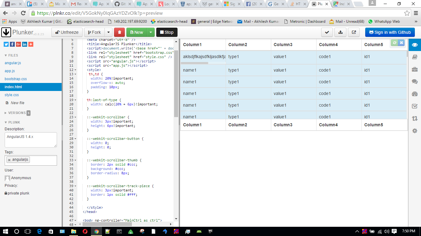
Answers 11
Here is more simpler solution. Take a look to this codepan.
Click linkhere
Answers 12
I have simply altered your style.css in Plunker demo as follows
/* Put your css in here */ table { table-layout: auto; display: flex; flex-flow: column; max-height: 300px; } table thead, table tfoot, table tbody tr { display: table; table-layout: fixed; } tbody td, thead th, tfoot td{ border-right: 1px solid transparent; vertical-align: middle; text-align: center; white-space: normal; word-wrap: break-word; text-wrap: normal; } table thead { /*flex: 0 0 auto;*/ width: 100%; } table tfoot { /*flex: 0 0 auto;*/ width: 100%; } table tbody { flex: 1 1 auto; display: block; overflow-y: auto; } table tbody tr { width: 100%; } 
0 comments:
Post a Comment